Vehicle Asset Management
Redesigning a legacy fleet platform that employees had stopped using.
Vehicle Asset Management is BT’s internal platform for managing vehicle transfers and parking locations across a multi-tier driver and fleet hierarchy. As the sole product designer, I redesigned a legacy service that employees had abandoned, turning undocumented approval processes into a task-led platform built around how drivers and managers actually work.
A legacy platform employees had stopped using
The existing platform for managing vehicle transfers and parking locations was slow, confusing, and had fallen out of everyday use. Drivers and managers had quietly built their own workarounds, arranging transfers over email and phone, tracking parking locations in spreadsheets, leaving the official system incomplete and unreliable.
The consequences went beyond inconvenience: data gaps, inconsistent processes, and reduced visibility of a national vehicle fleet. The design challenge meant untangling approval processes, undocumented business rules, and role-based permissions spanning Drivers, Patch Managers and Fleet Leads, none of which existed on paper.
Users weren’t exploring, they were completing tasks
Every session pointed the same way: users arrived to do one thing, transfer a vehicle, update a parking bay, and left. The platform needed to be structured around tasks, not a navigation hierarchy.
Approval logic was undocumented. Implementing it wrong would either block legitimate users or over-grant access, making the permissions model as much a design problem as an engineering one.
Patch Managers and Fleet Leads wanted an operational view of where vehicles were and who moved them, not another admin tool to maintain.
“…as a new manager… not easy to find the right way… you end up ringing colleagues for coaching.”
“…if they don’t accept it within 48 hours, the transfer gets cancelled and locked up in eOrg… you have to email the helpdesk to release it and start over.”
“…we need to see who’s made the allocation… trailers go missing… knowing who moved it helps track the asset.”
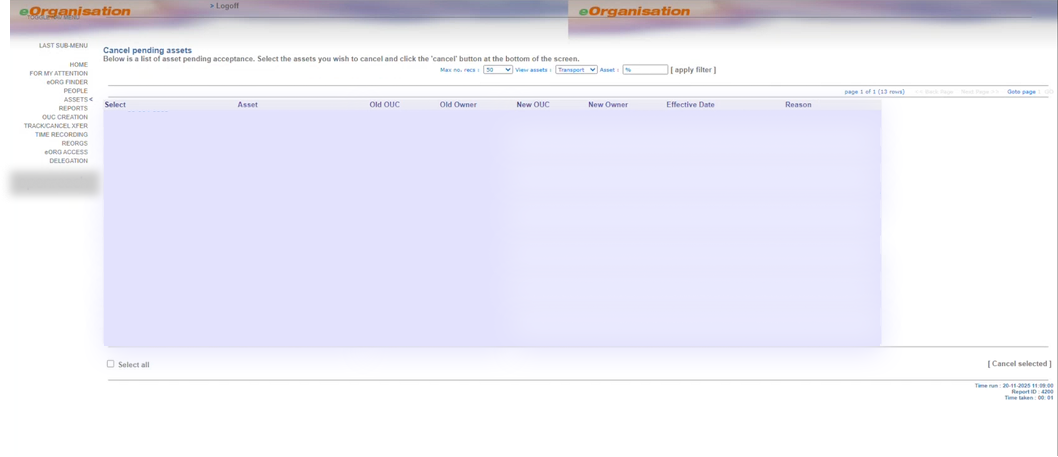
“…a one-stop shop… so I don’t have to jump between systems… centralise reallocations and mapping.”
“Like I’ve been trying to get on this morning, I can’t even get on.”
Mapping a complex approval ecosystem
Because the approval processes existed only in people’s heads, the first phase of work was archaeological. Through a series of workshops with drivers, managers and fleet stakeholders, I mapped how vehicle transfers and parking amendments actually happened, who initiated them, who approved them, and where they broke down.
I translated those undocumented rules into a scalable role-based permissions model spanning Drivers, Patch Managers, Fleet Leads and Business Owners across two distinct organisational structures. This model became the foundation for the platform’s architecture and every UX decision that followed.
Two organisational structures, Org 1 and Org 2, with different hierarchies had to resolve into one permissions model.
Business Owners existed in only one structure, one of many undocumented asymmetries the workshops surfaced.
Drivers sit at the base of every branch, the volume users the mobile-first experience was designed for.
Designing around real-world behaviour
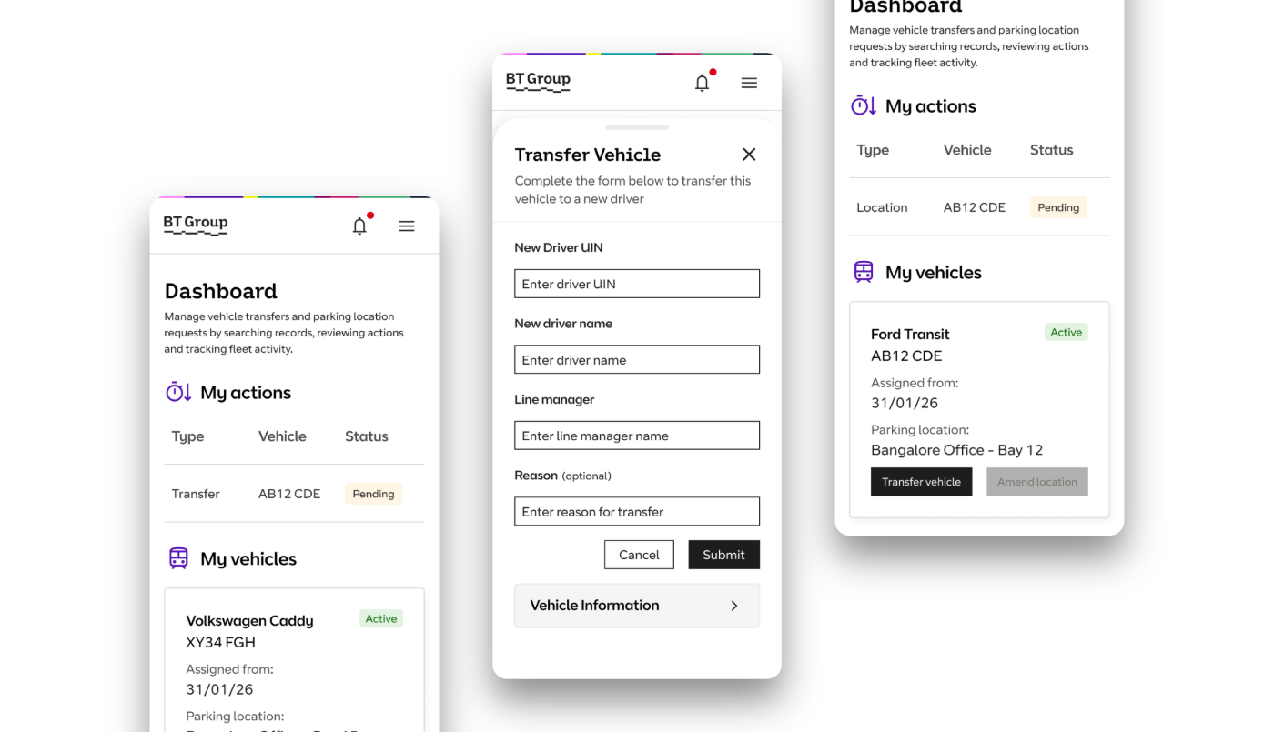
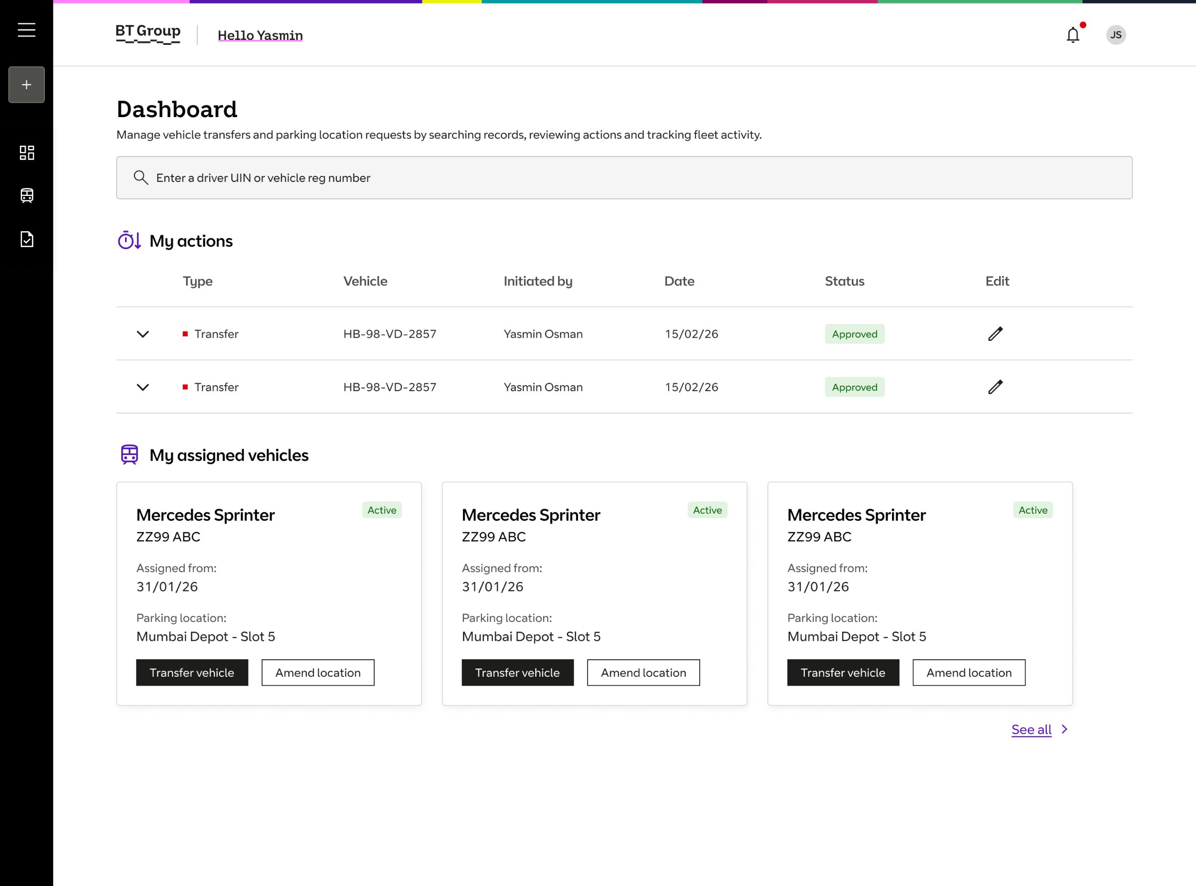
The research insight, task completion, not exploration, became the organising principle of the design. From a single dashboard, users could search drivers and vehicles, transfer vehicles, amend parking locations, track approvals and manage assets. Every workflow started from the task, not from a menu.
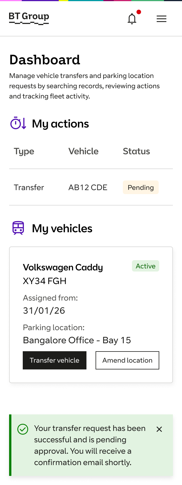
Because drivers work in the field, the experience was designed mobile-first: a transfer could be initiated, tracked and approved from a phone, with the full audit trail, previous owner, line manager, reason, captured in the flow rather than reconstructed afterwards.
Challenging an AI-first approach
Midway through the project, leadership proposed a ChatGPT-style conversational landing page as the platform’s primary entry point. The research said otherwise: users completing quick, repetitive tasks wanted direct access, not a conversation. Rather than dismiss the idea, I tested both approaches with users.
Users consistently preferred direct access to their tasks. The evidence settled the debate without confrontation, AI remained part of the platform’s wider vision, but not as the primary entry point. The final release delivered a task-focused dashboard, role-based permissions, a vehicle transfer flow, parking location management and a mobile experience.
Validated with users
Vehicle transfers completed without prompting or help in usability testing.
Of users preferred the new platform to the old one and expressed the ease of use and convenience it gave them in their roles.
Needed to complete the 3 flows tested.
Permissions model for drivers, patch managers, fleet leads and business owners, now the reference documentation.
In usability testing, drivers and patch managers found the dashboard easy to understand, completed vehicle transfers without guidance, and updated parking locations confidently.
Participants consistently preferred the new platform over the existing system, citing fewer steps and clearer actions, and satisfaction was high across both driver and manager groups. The permissions model and service map remain the definitive documentation of how the fleet process works.